Brand Strategy | Graphic Design | Digital Design
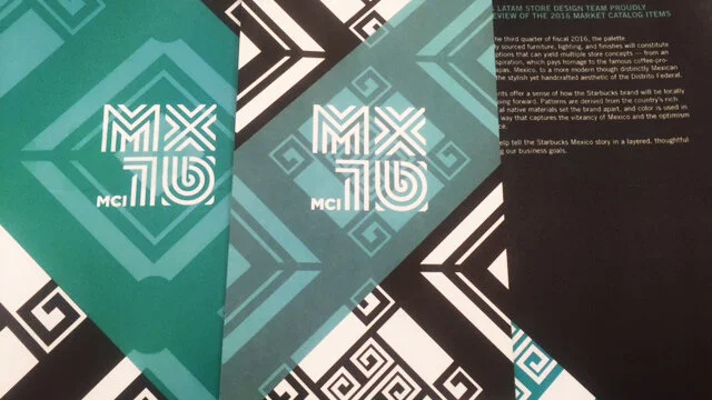
Starbucks, Large-Scale Project Branding, Mexico FF&F Palette
New York, NY | Mexico City, Mexico
The branding of the Mexico FF&E palette development initiative within the Starbucks company is a case study in using brand-building principles to drive change and win project support in a large organization. The effort of branding the project not only made it possible but made it a success.
Myriad political issues, strategic misalignments, and general misconceptions were preventing progress toward an FF&E palette specifically for Mexico — the first ever, despite having more than 600 stores in the market to date. To break through the fog, Scott Mitchem and his team created something bigger than a workstream: a beloved brand.
First, it signaled progress in a professional, organized way, which helped with the political environment. A new communications platform was launched, giving an optimistic and inspiring new voice to a project once mired in redundant meetings and misunderstandings; it was consistently branded, driving recognition and familiarity.
As the project continued, deliberate storytelling and recognition of team members drove emotional connection and excitement, and the wider cross-functional team took pride in a project that set them apart from the Americas region in a positive way.
The work itself was seen as an unqualified success. Together with its branding, the overall initiative became significant within the company and a blueprint for future success. This led to new investment and, ultimately, a new role for Scott Mitchem as Americas Concepts Director, with a mandate to reboot the FF&E work for the entire Americas region.
Credits: Americas Concepts Director Scott Mitchem; Concepts Design Managers Corrie Bell, Jay Keller, Angelica Valencia, and Jonah Wilcox-Healy; Program Manager Brian Collins; Concepts Coordinators Karina Yob and Lauren Williams; photos courtesy of Starbucks
Visual Elements
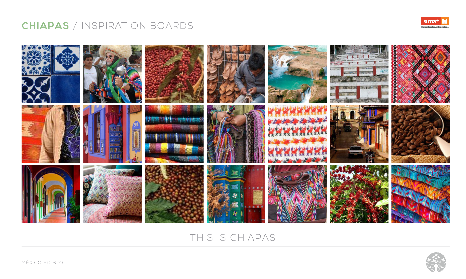
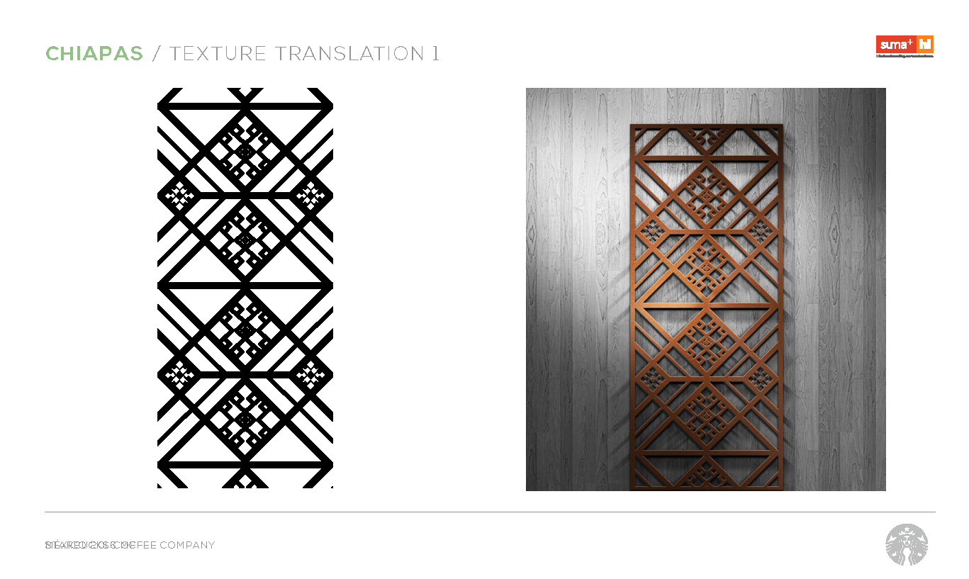
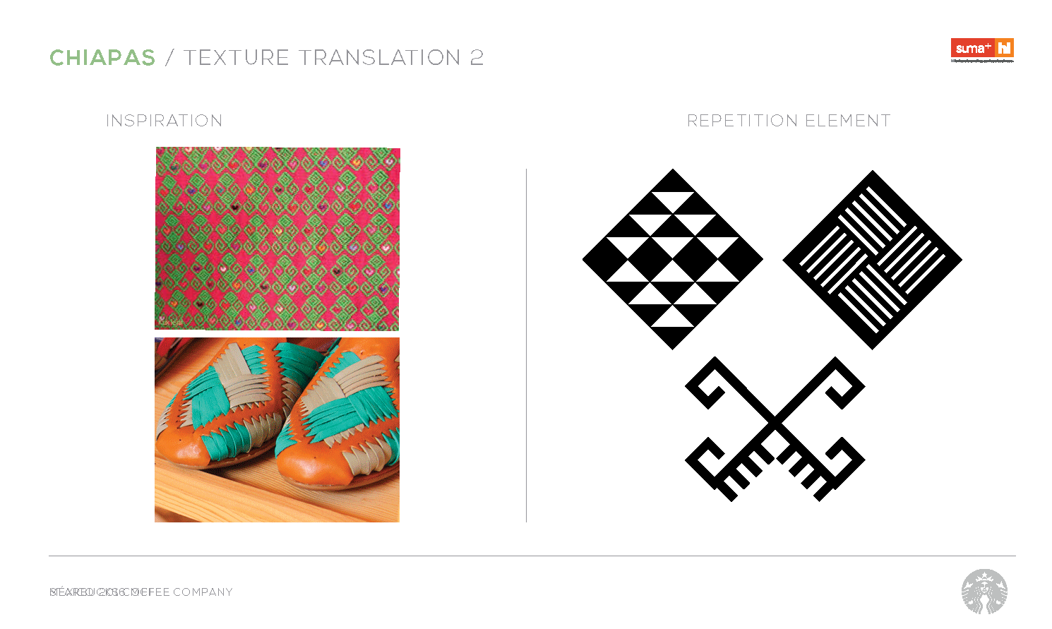
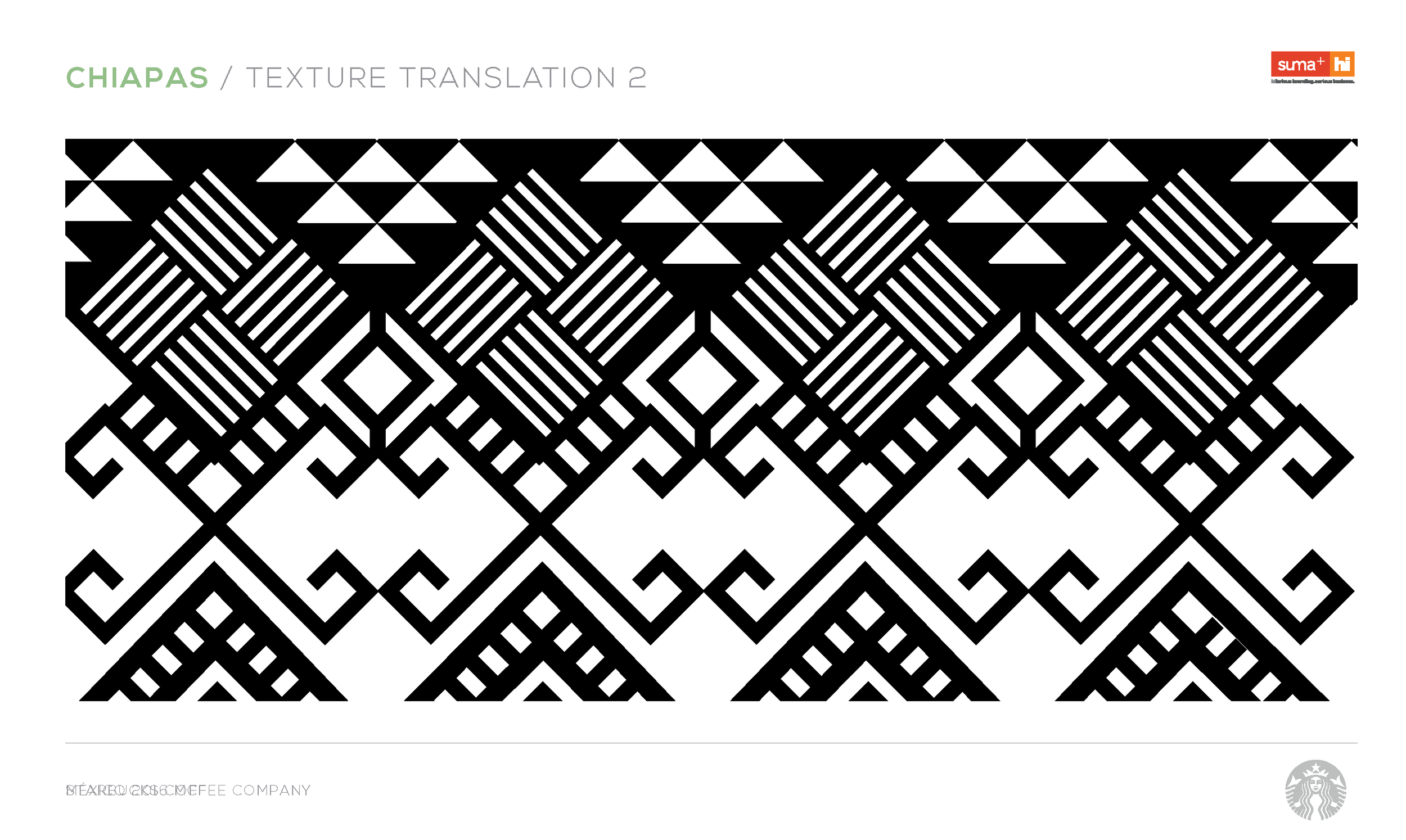
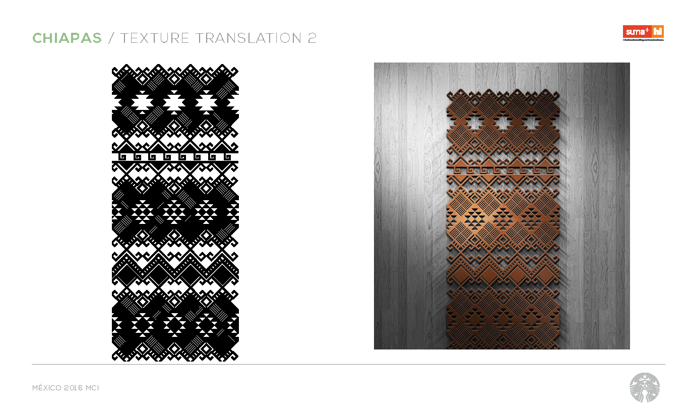
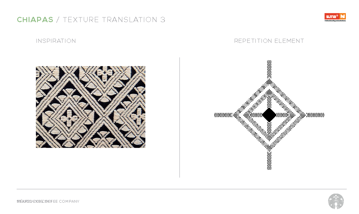
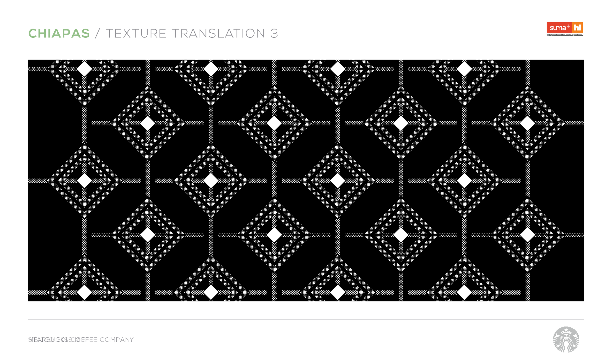
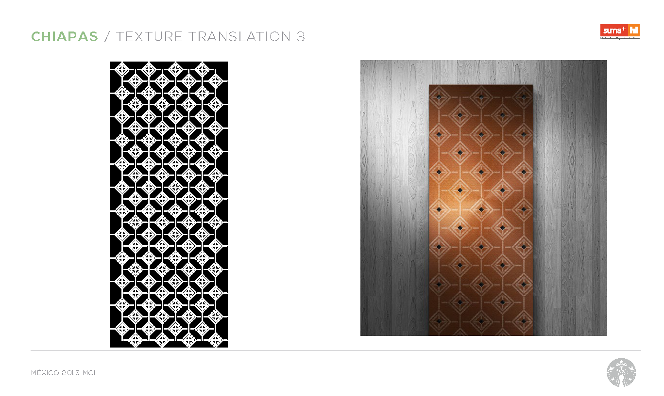
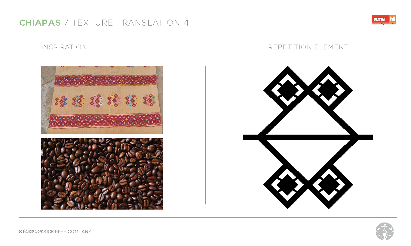
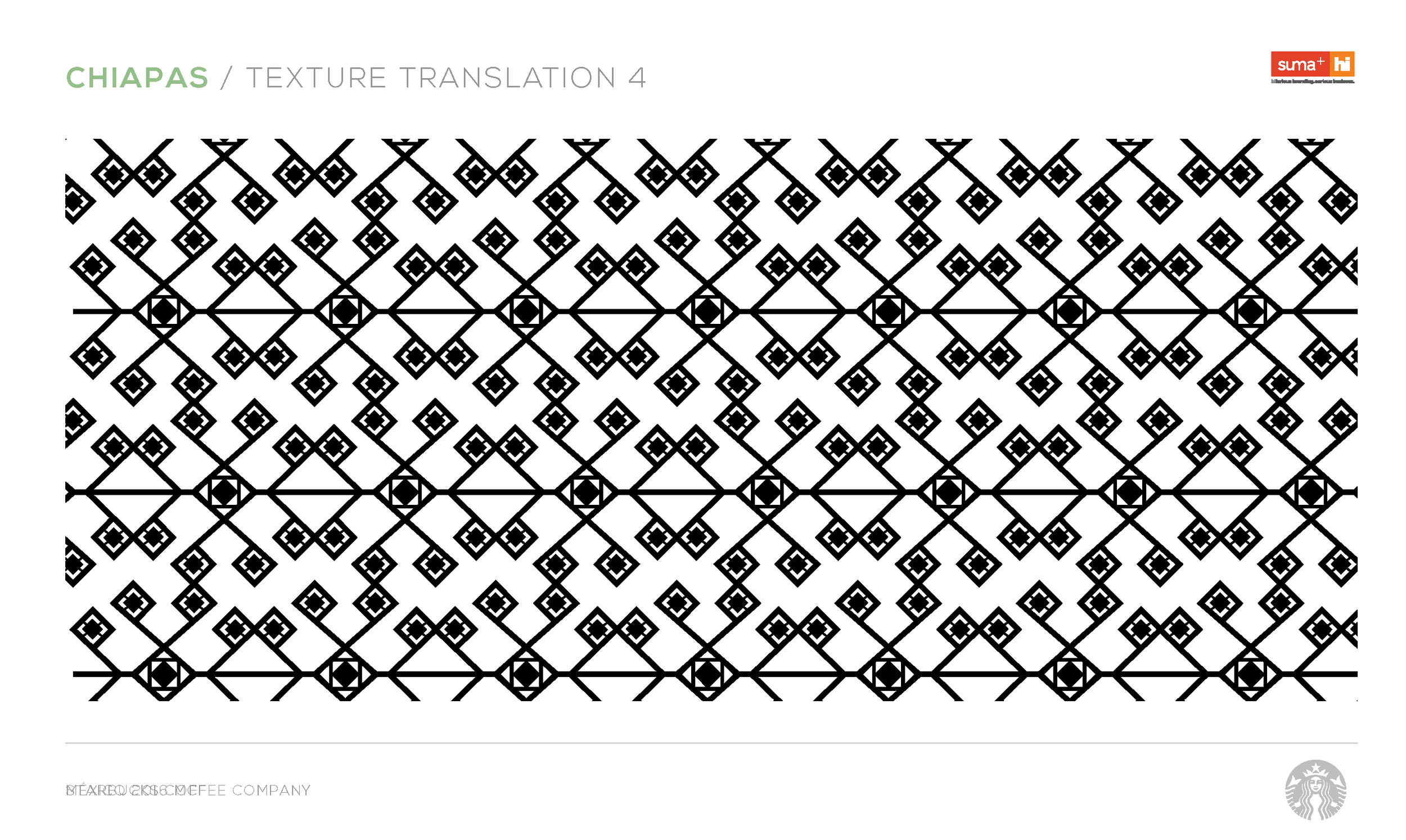
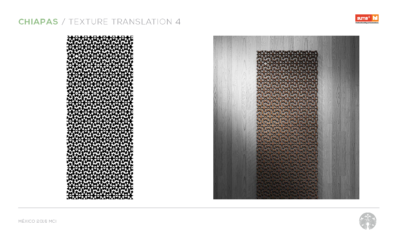
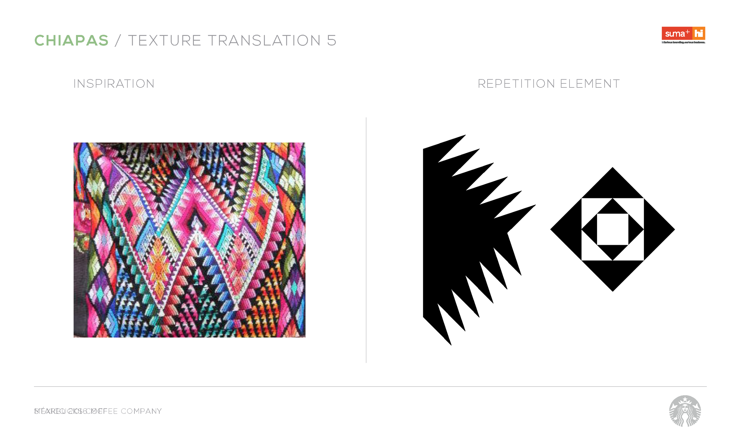
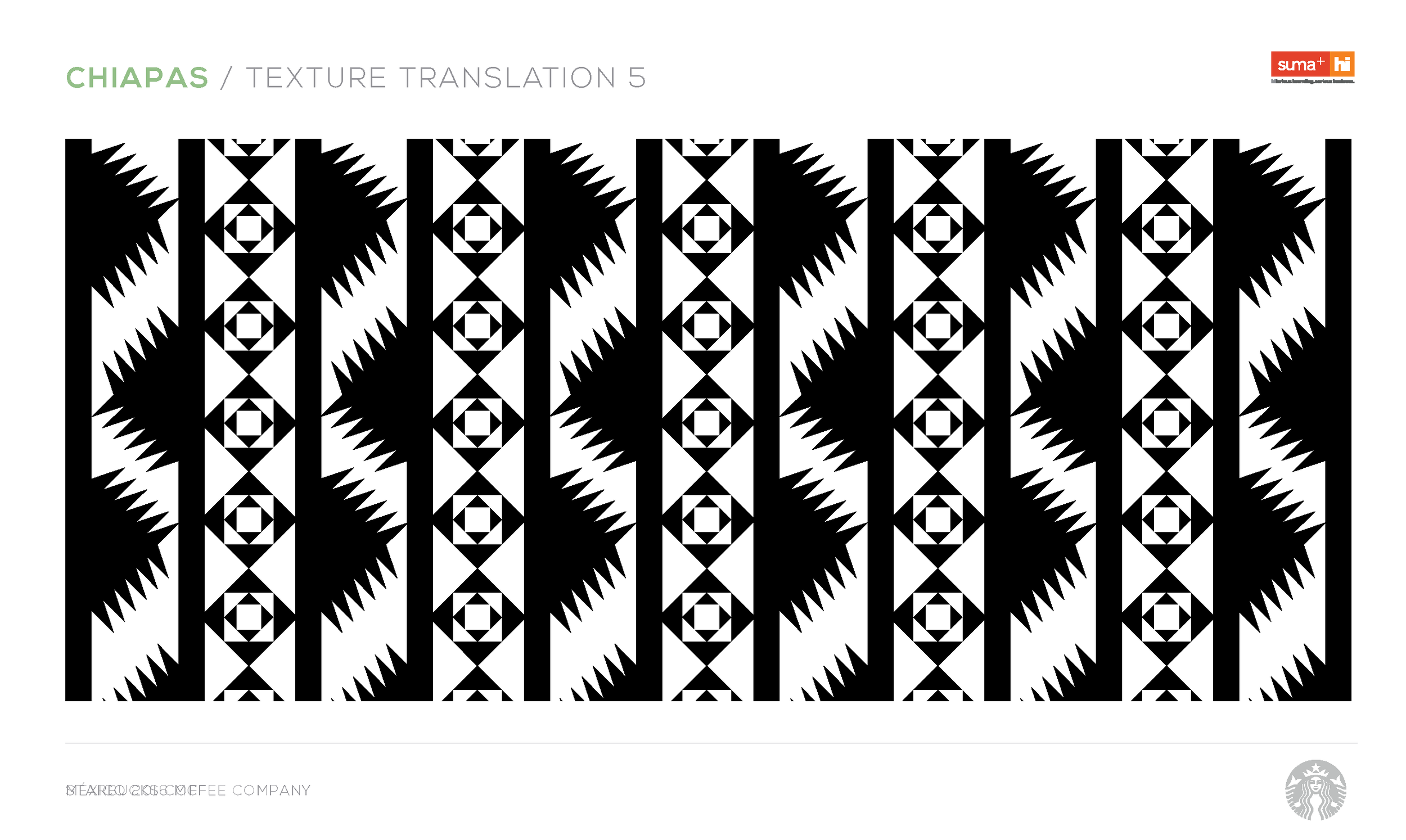
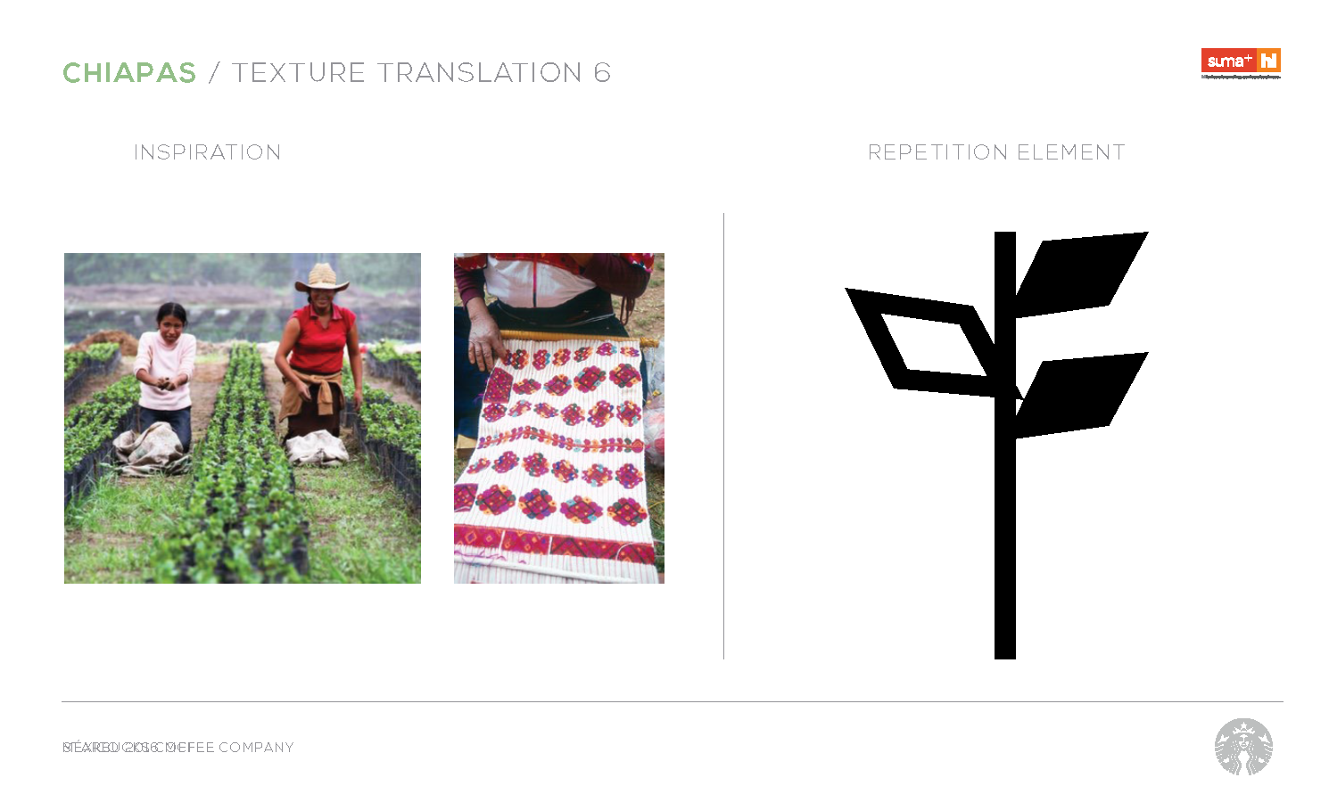
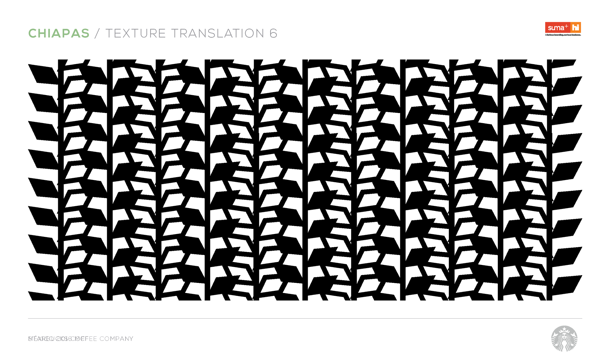
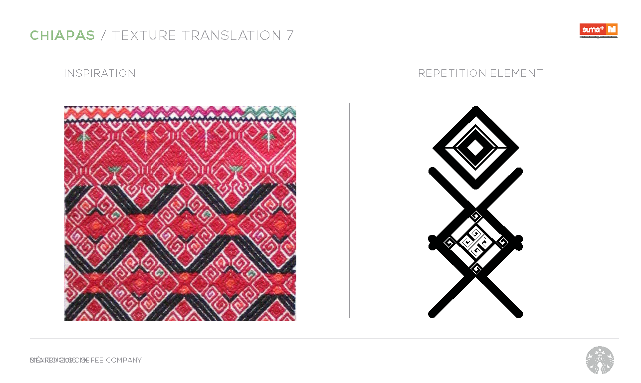
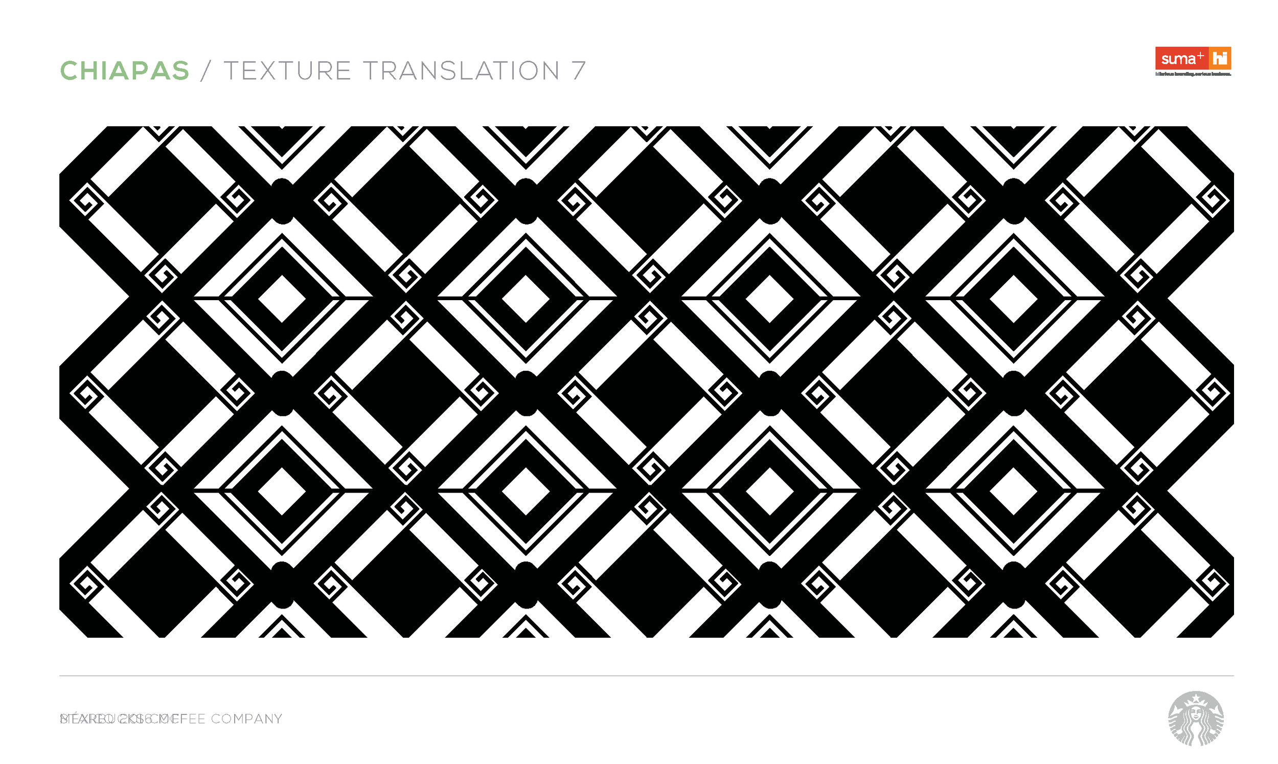
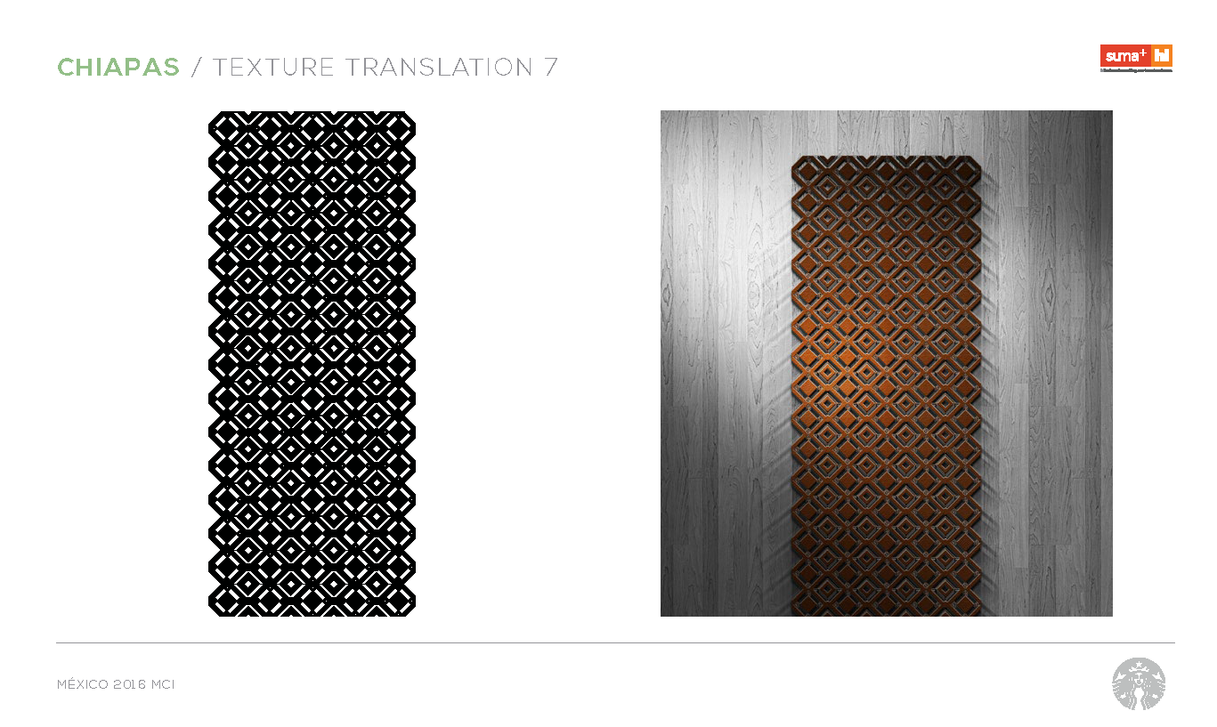
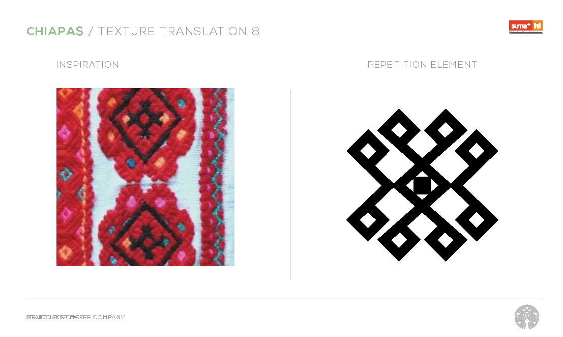
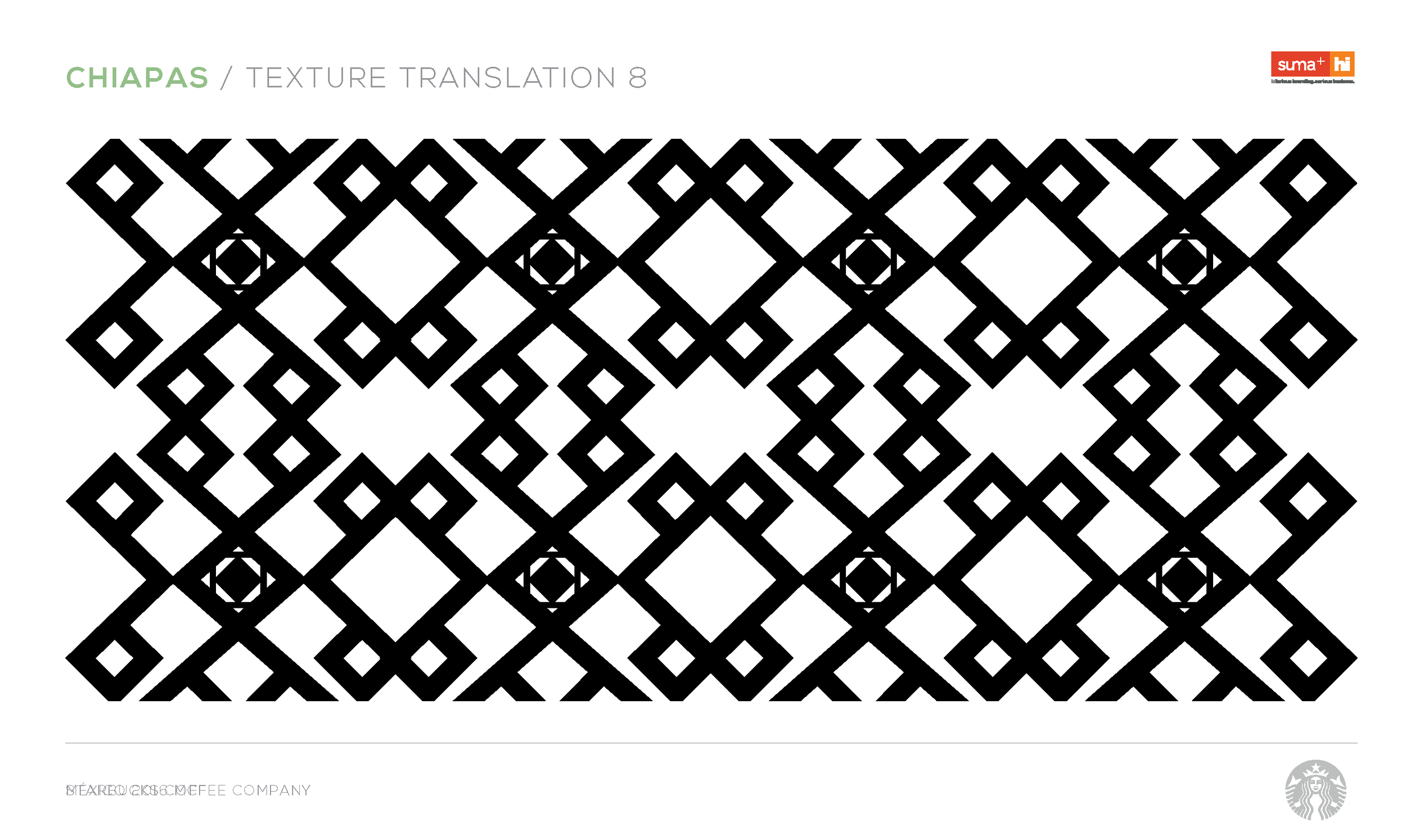
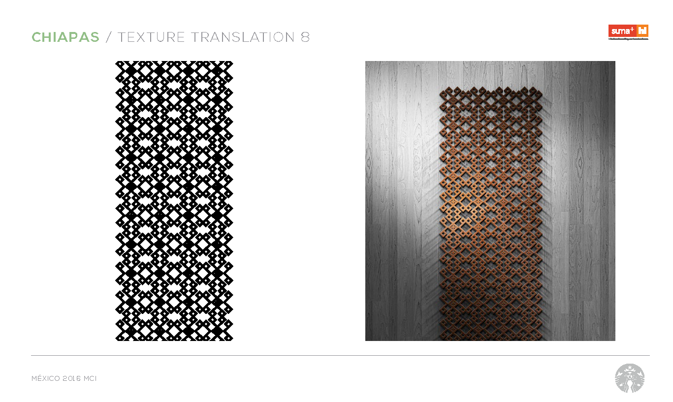
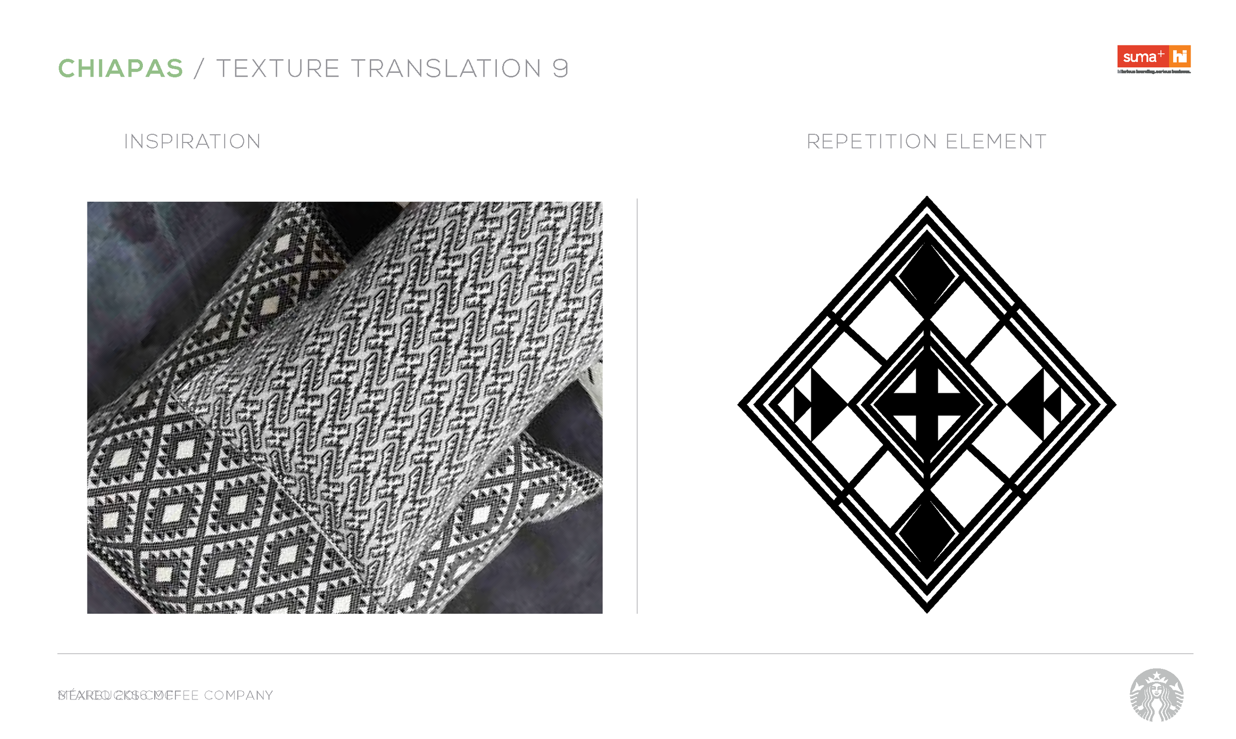
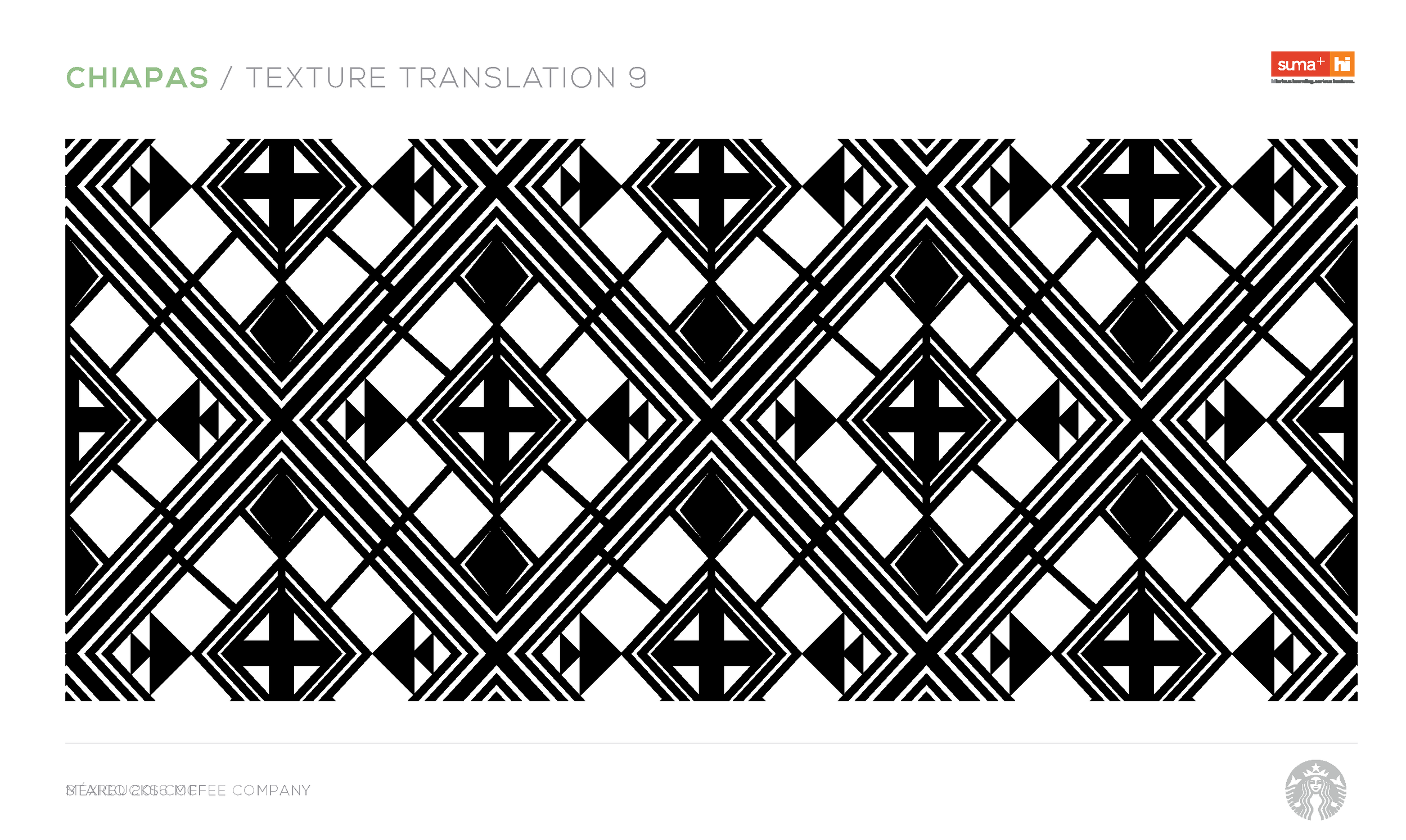
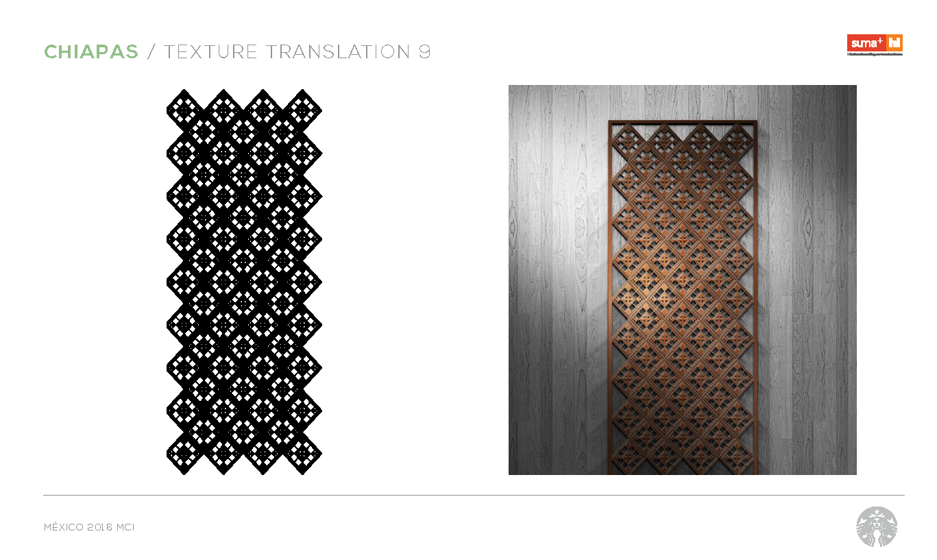
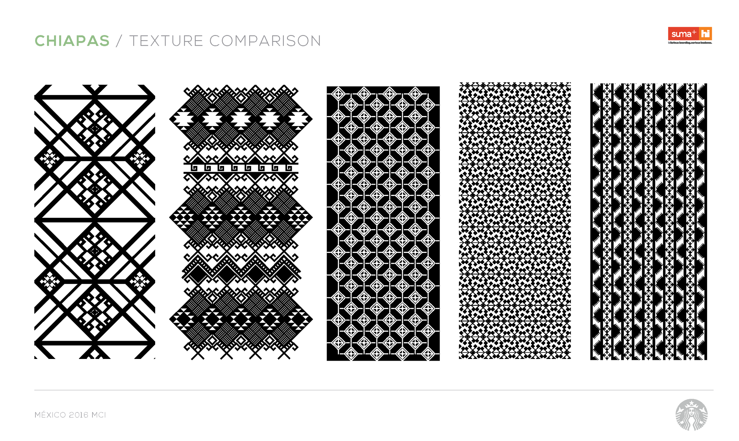
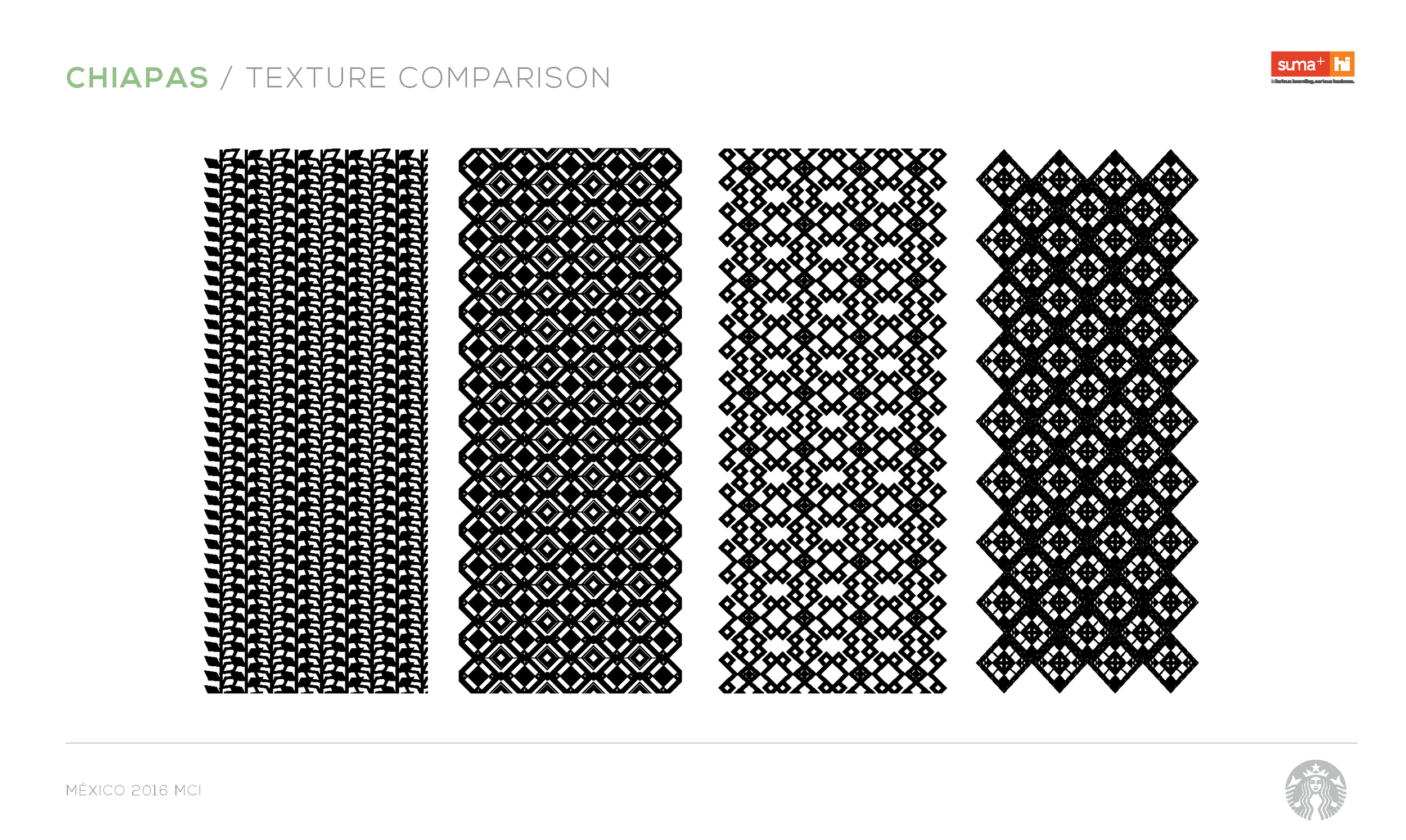
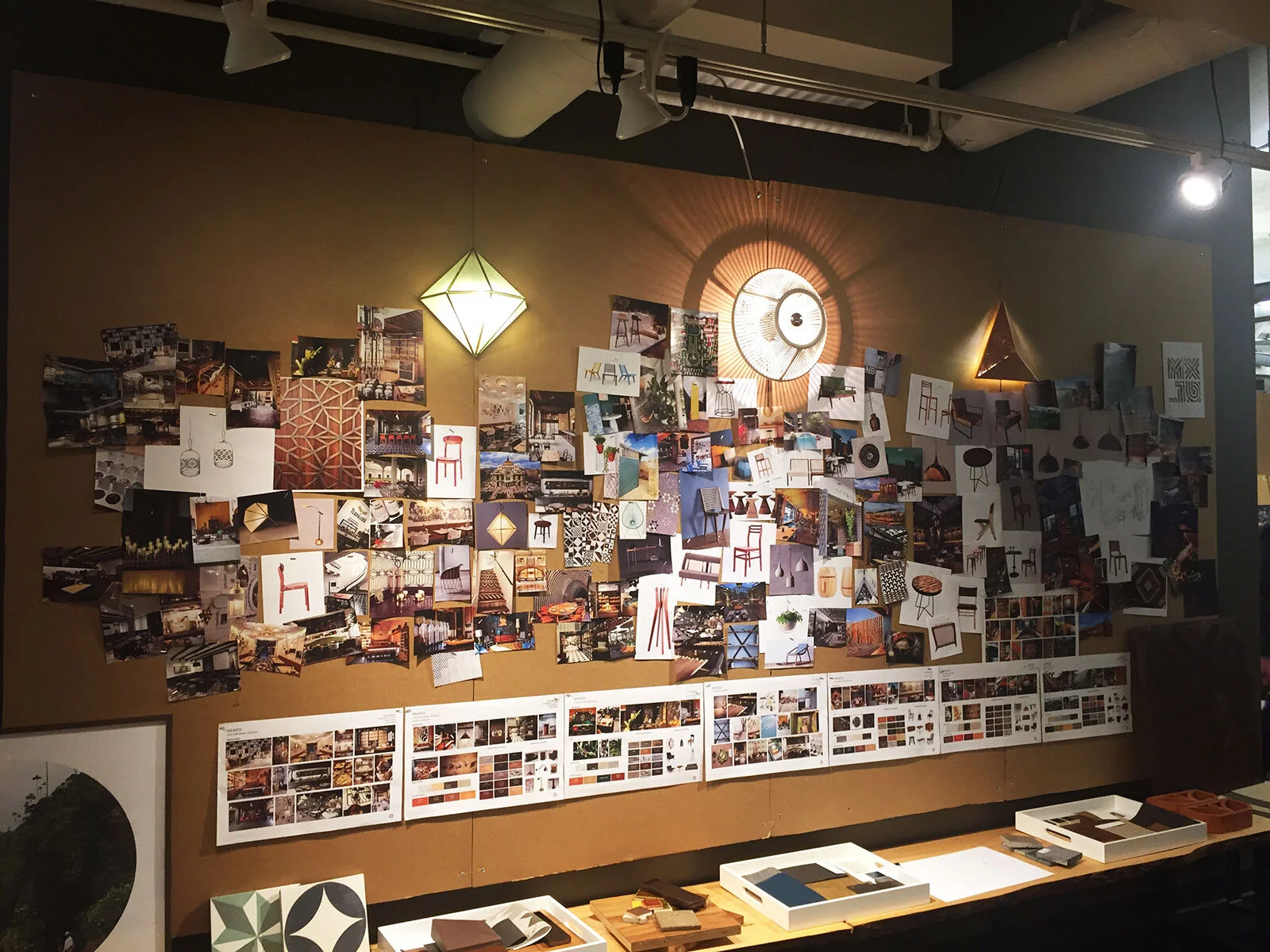
The system married traditional pattern inspiration from Mexico’s Chiapas coffee region (see R&D deck below) with the modern sensibility of its capital city — just like the palette itself.
Graphic design by Suma+, Mexico City
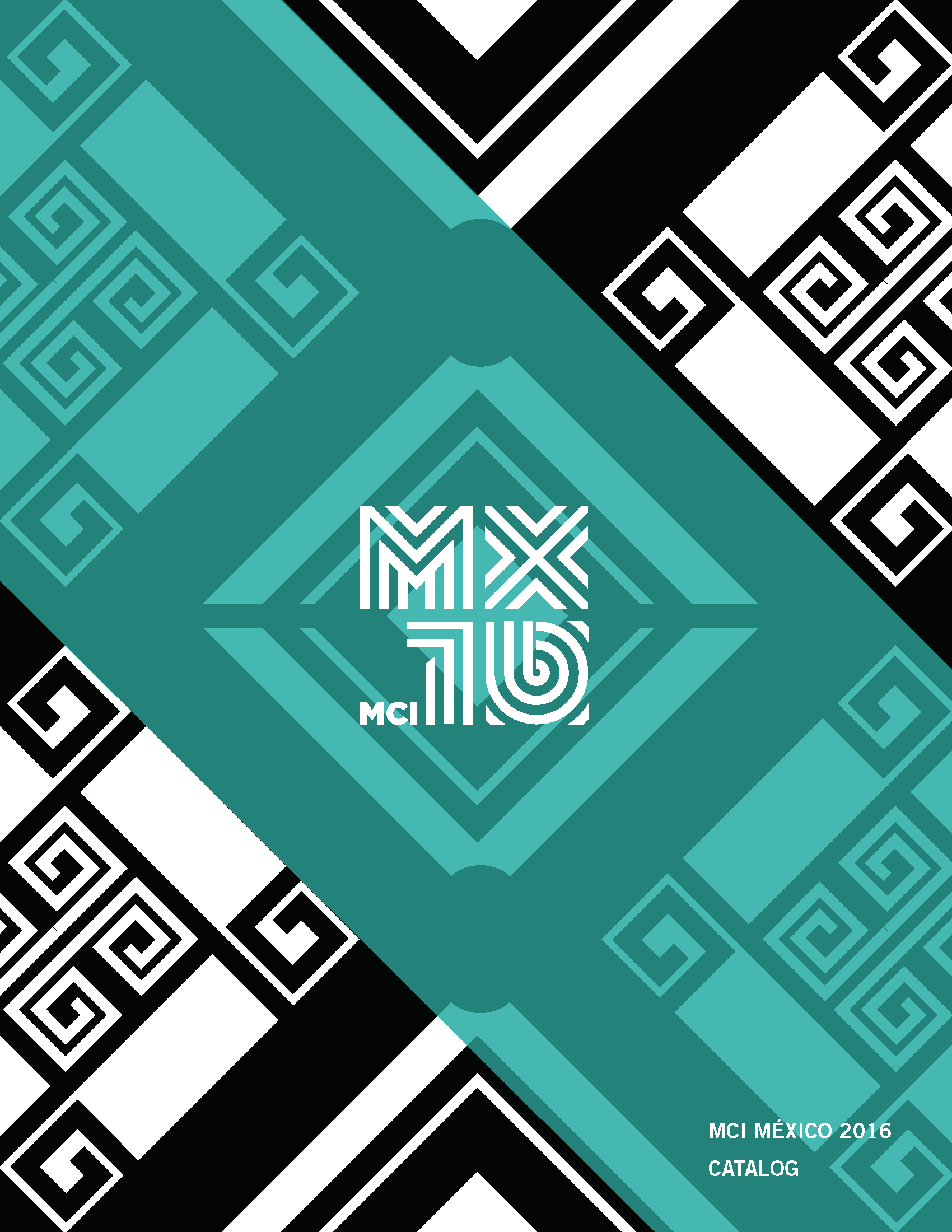
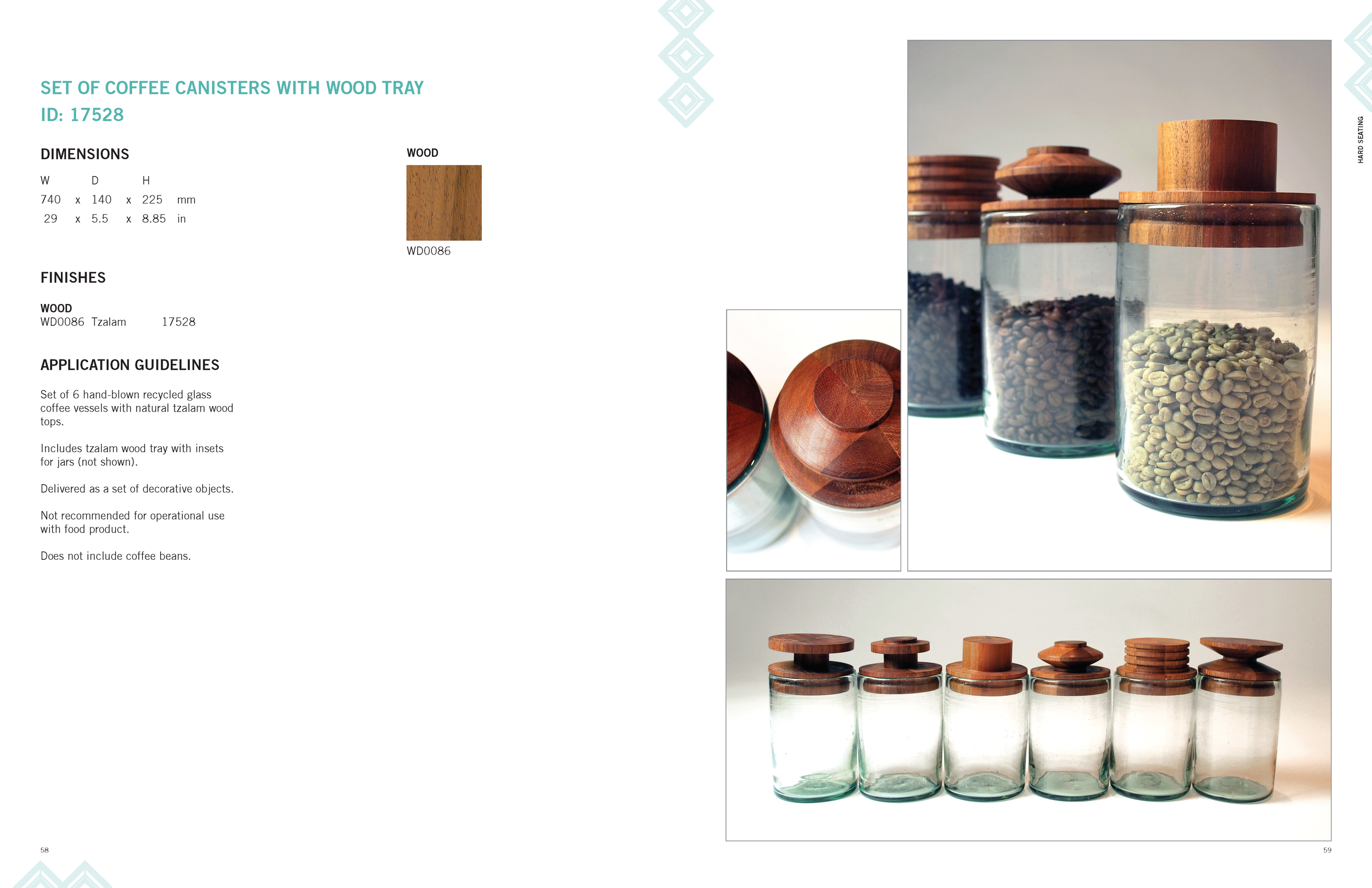
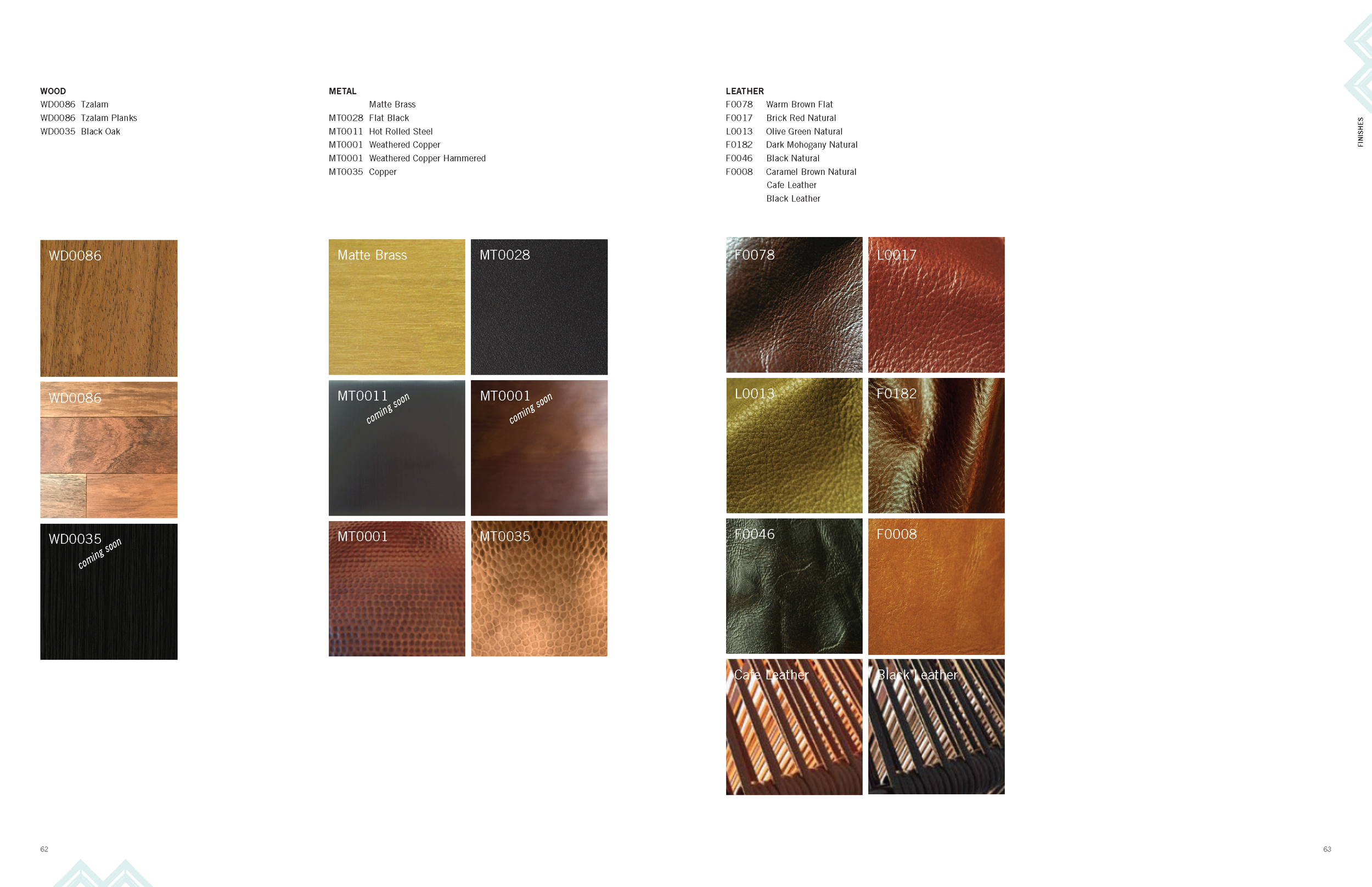
A printed catalog was requested by the Mexico design team as a quick reference alternative to a slow and overburdened intranet, designed in-house by the concepts coordinator. The catalog was an element of the print portion of the project’s communication plan.
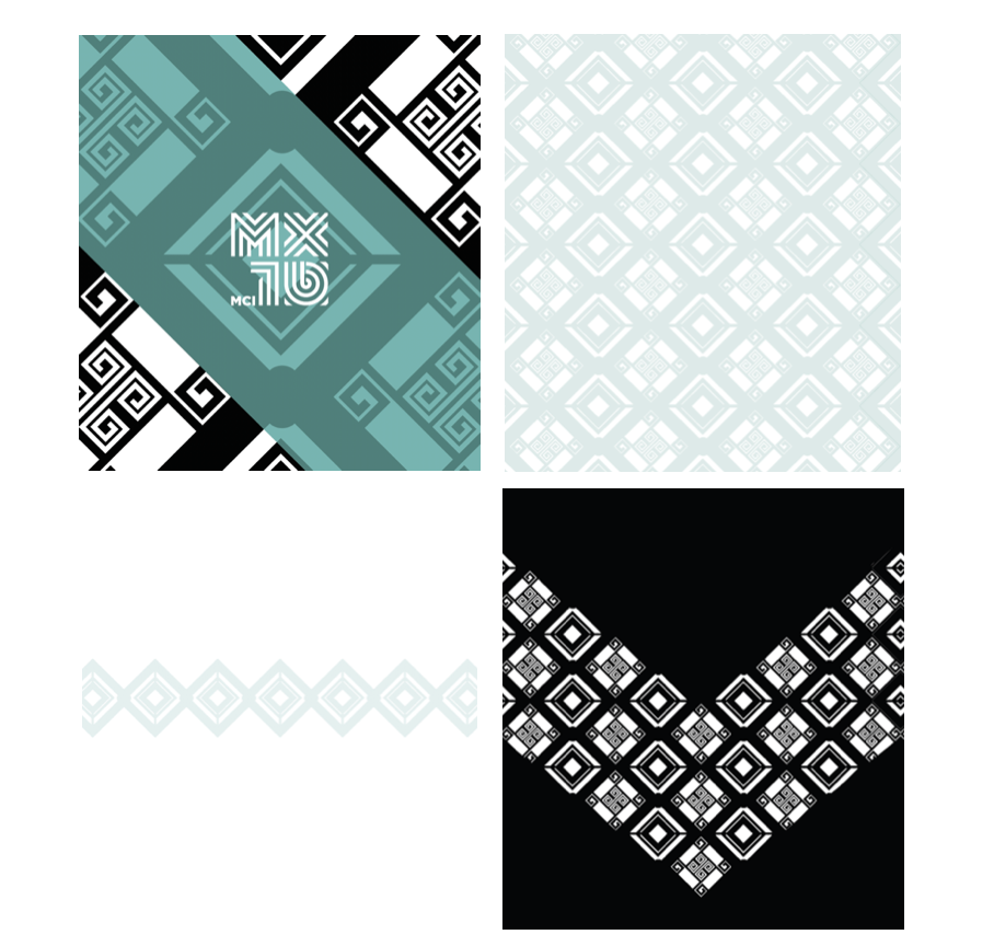
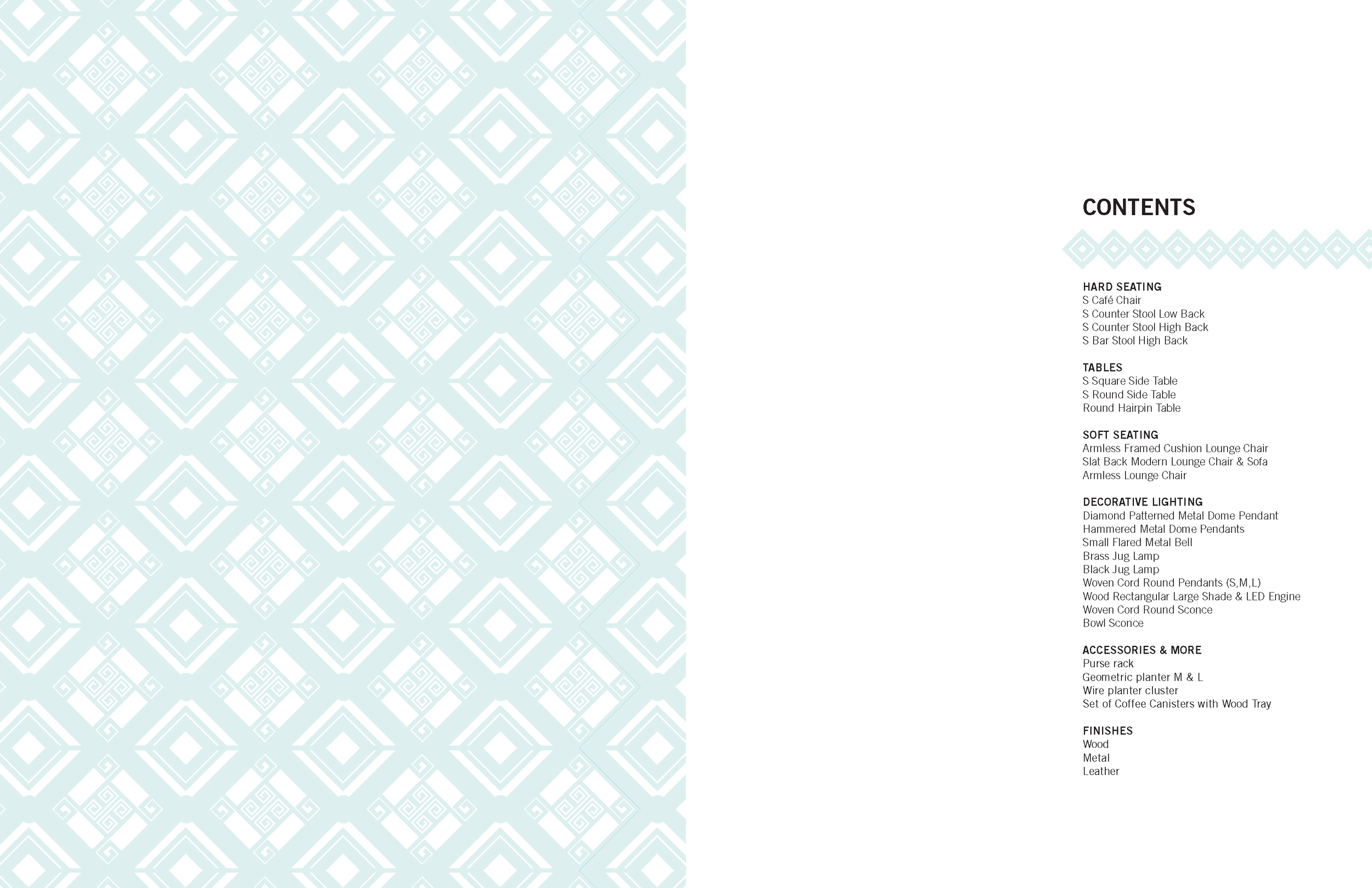
Mexico FF&F Catalog


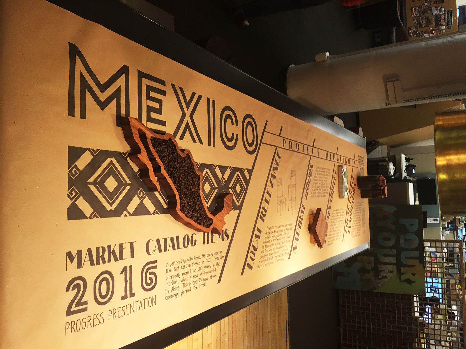
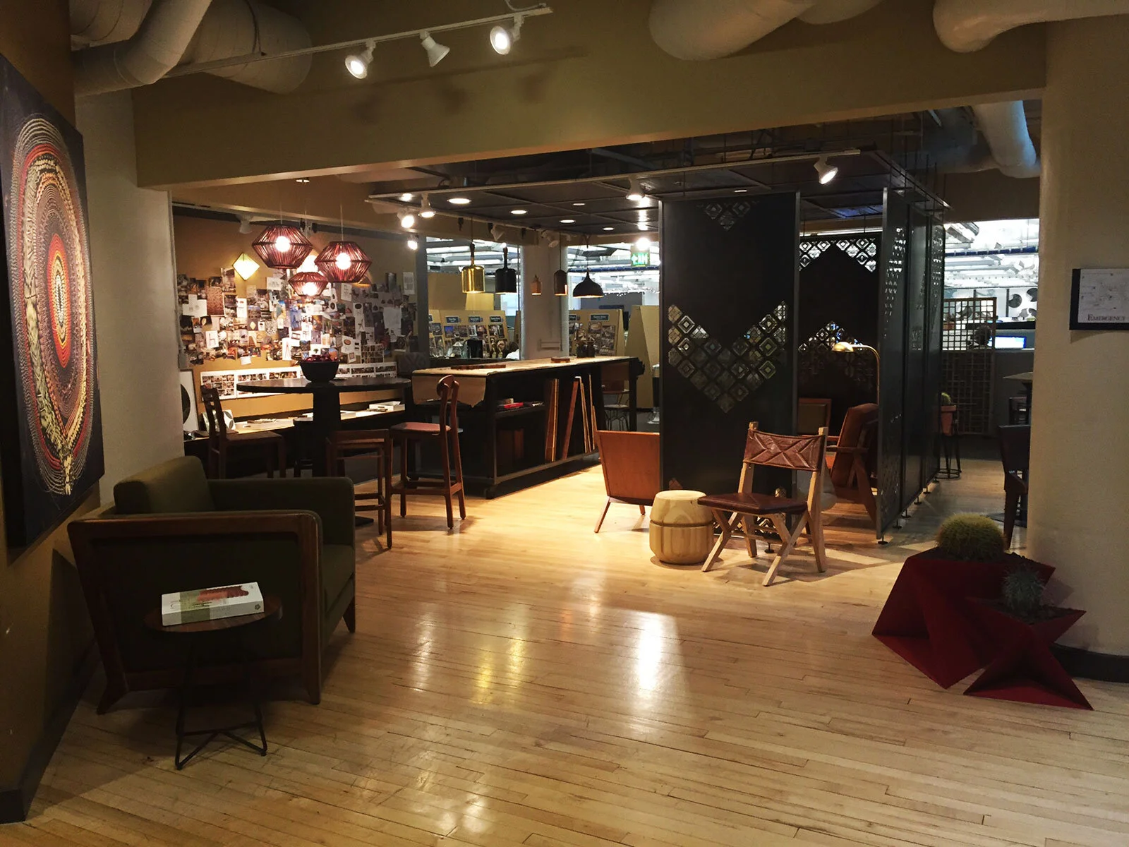
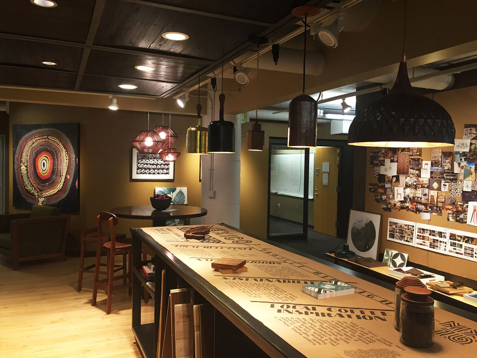
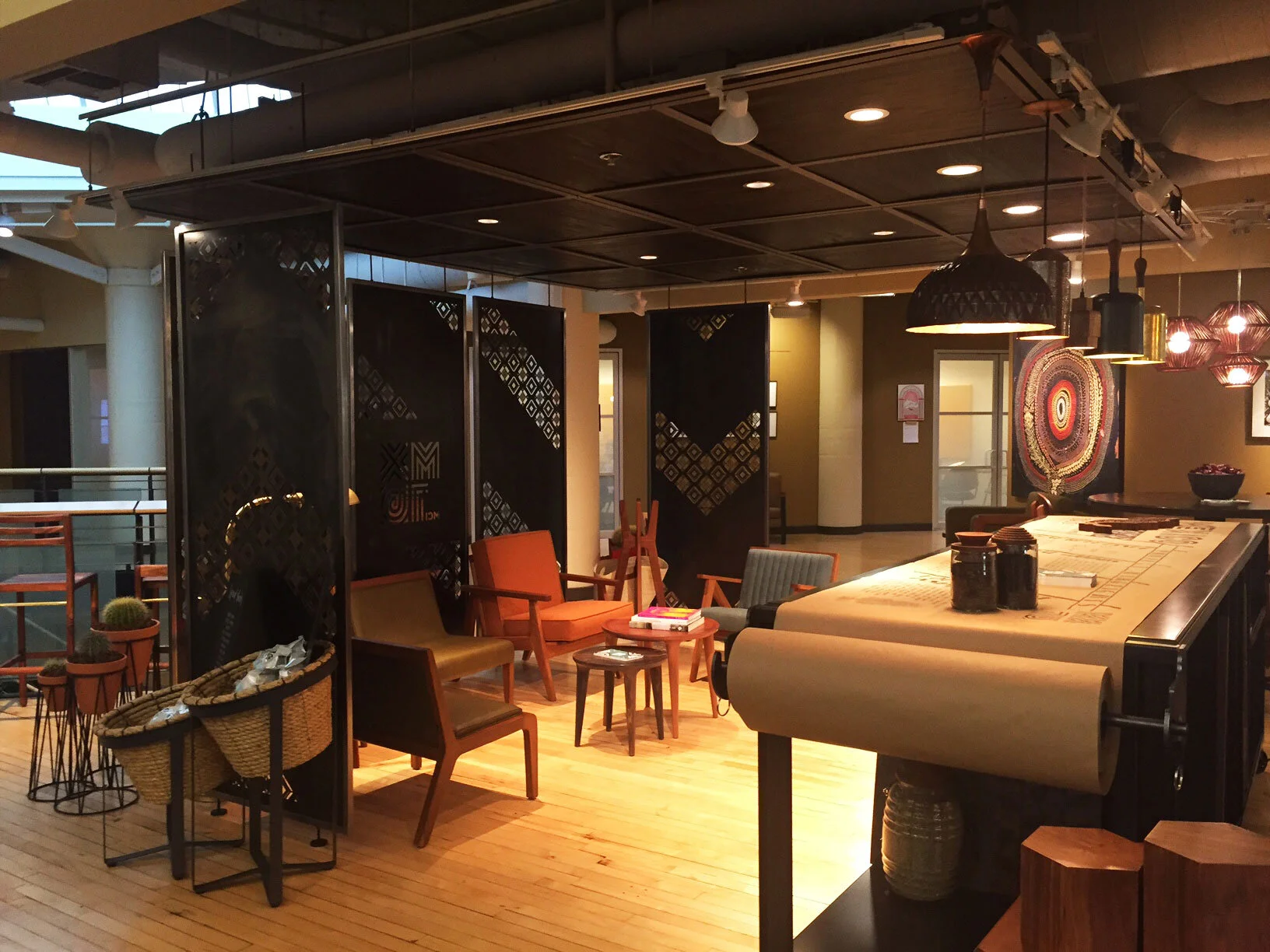
Mexico FF&F Palette Internal Exhibition
An internal exhibition of selected Mexico FF&E palette items installed in Starbucks’ Seattle headquarters demonstrated the progress being made toward local relevance and new furniture development in the LATAM region. Leadership and end-user walk-throughs were particularly effective, allowing for clear communication on design and business concerns and generating genuine excitement that sparked a shift in organizational thinking.
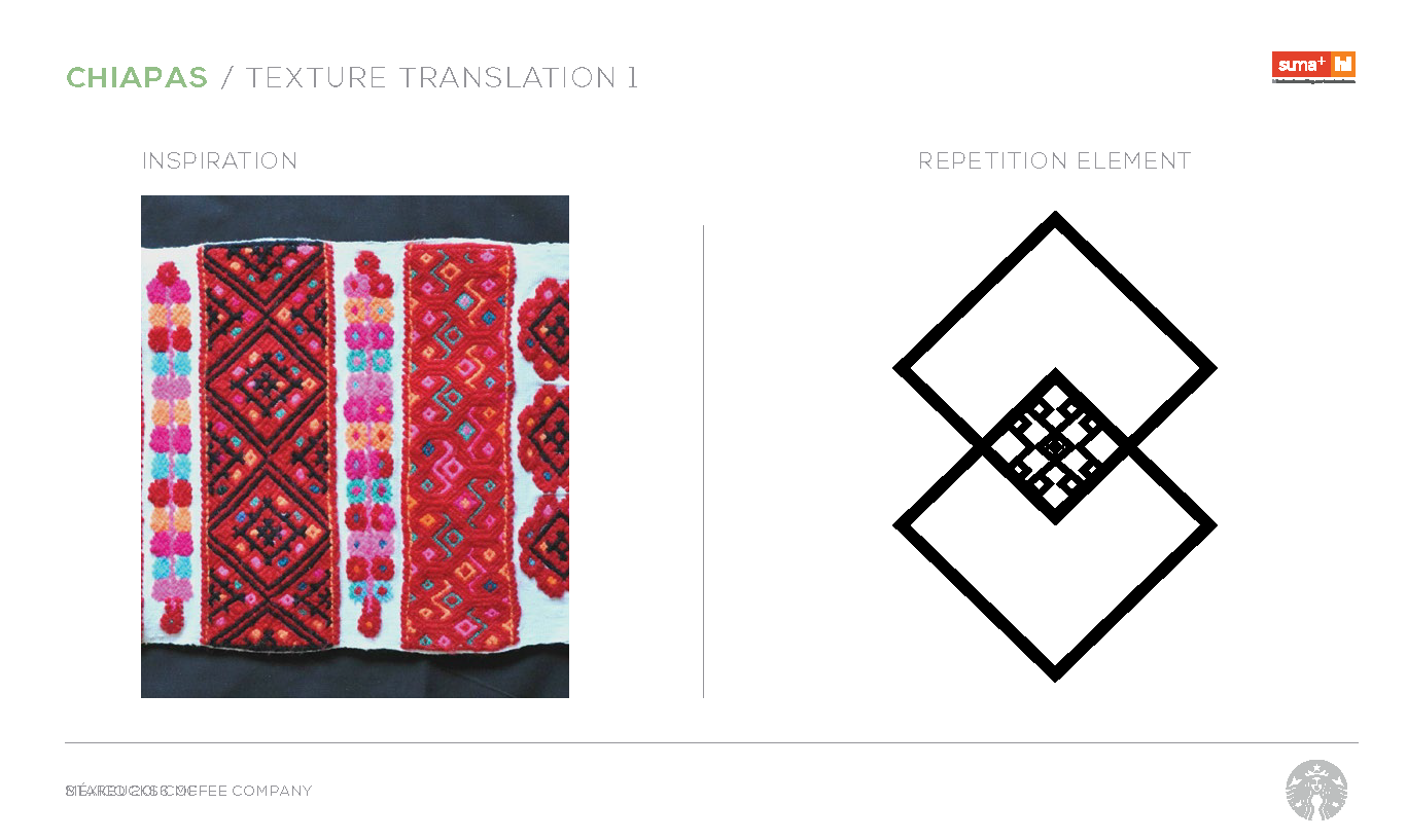
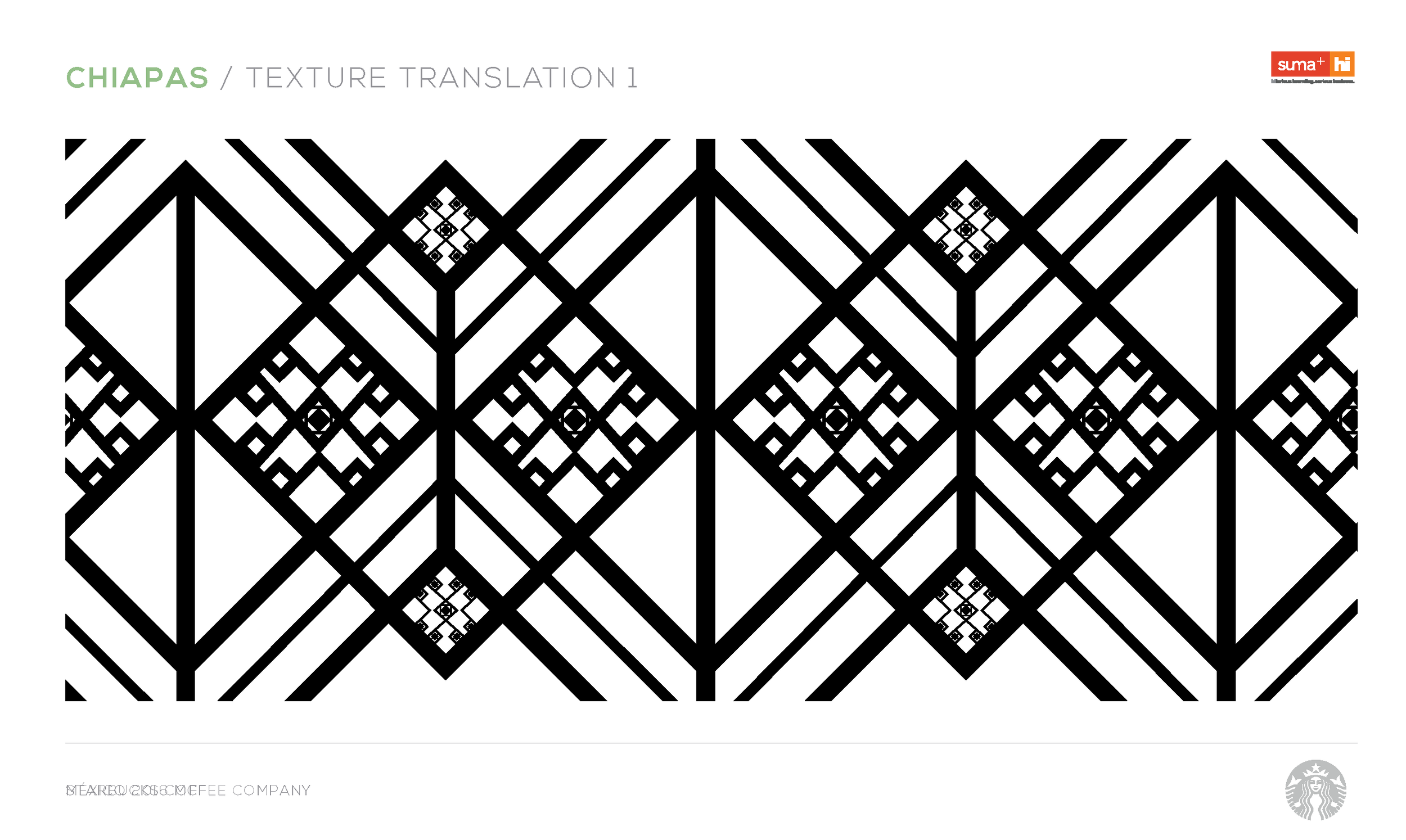
Mexico FF&F Palette Branding, Research & Development
Mexico City–based creative agency Suma+ developed a series of pattern options based on their research into traditional patterns from Mexico’s famous coffee regions. The selected pattern became the basis of the branding campaign.